Update 2: Okay, I think it's fixed.
Update: I just realized the code posted badly. I don't know why. It looks good in the cross-post at G-FEED. I'll try to fix.
If google scholar is any guide, my 2009 paper with Wolfram Schlenker on the nonlinear effects of temperature on crop outcomes has had more impact than anything else I've been involved with.
A funny thing about that paper: Many reference it, and often claim that they are using techniques that follow that paper. But in the end, as far as I can tell, very few seem to actually have read through the finer details of that paper or try to implement the techniques in other settings. Granted, people have done similar things that seem inspired by that paper, but not quite the same. Either our explication was too ambiguous or people don't have the patience to fully carry out the technique, so they take shortcuts. Here I'm going to try to make it easier for folks to do the real thing.
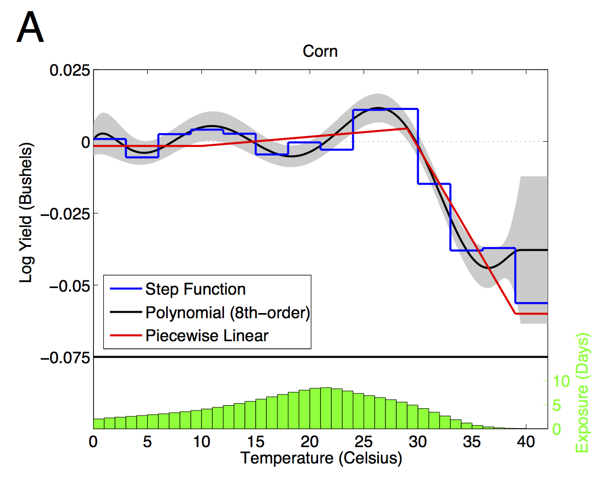
So, how does one go about estimating the relationship plotted in the graph above?
Here's the essential idea: averaging temperatures over time or space can dilute or obscure the effect of extremes. Still, we need to aggregate, because outcomes are not measured continuously over time and space. In agriculture, we have annual yields at the county or larger geographic level. So, there are two essential pieces: (1) estimating the full distribution of temperatures of exposure (crops, people, or whatever) and (2) fitting a curve through the whole distribution.
The first step involves constructing the distribution of weather. This was most of the hard work in that paper, but it has since become easier, in part because finely gridded daily weather is available (see PRISM) and in part because Wolfram has made some STATA code available. Here I'm going to supplement Wolfram's code with a little bit of R code. Maybe the other G-FEEDers can chime in and explain how to do this stuff more easily.
First step: find some daily, gridded weather data. The finer scale the better. But keep in mind that data errors can cause serious attenuation bias. For the lower 48 since 1981, the PRISM data above is very good. Otherwise, you might have to do your own interpolation between weather stations. If you do this, you'll want to take some care in dealing with moving weather stations, elevation and microclimatic variations. Even better, cross-validate interpolation techniques by leaving one weather station out at a time and seeing how well the method works. Knowing the size of the measurement error can also help correcting bias. Almost no one does this, probably because it's very time consuming... Measurement error in weather data creates very serious problems (see here and here)
Second step: estimate the distribution of temperatures over time and space from the gridded daily weather. There are a few ways of doing this. We've typically fit a sine curve between the minimum and maximum temperatures to approximate the time at each degree in each day in each grid, and then aggregate over grids in a county and over all days in the growing season. Here are a couple R functions to help you do this:
# This function estimates time (in days) when temperature is
# between t0 and t1 using sine curve interpolation.  tMin and
# tMax are vectors of day minimum and maximum temperatures over
# range of interest.  The sum of time in the interval is returned.
# noGrids is number of grids in area aggregated, each of which
# should have exactly the same number of days in tMin and tMax

days.in.range <- span=""> function( t0, t1 , tMin, tMax, noGrids )  {
  n   =  length(tMin)
  t0  =  rep(t0, n)
  t1  =  rep(t1, n)
  t0[t0 < tMin]   =  tMin[t0 < tMin]
  t1[t1 > tMax]  =  tMax[t1 > tMax]
  u  =  function(z, ind) (z[ind] - tMin[ind])/(tMax[ind] - tMin[ind])
  outside  =  t0 > tMax | t1 < tMin
  inside  =  !outside
  time.at.range  =  ( 2/pi )*( asin(u(t1,inside)) - asin(u(t0,inside)) )
  return( sum(time.at.range)/noGrids )
}

# This function calculates all 1-degree temperature intervals for
# a given row (fips-year combination).  Note that nested objects
# must be defined in the outer environment.
aFipsYear  =  function(z){
  afips   = Trows$fips[z]
  ayear    = Trows$year[z]
  tempDat  = w[ w$fips == afips & w$year==ayear, ]
  Tvect = c()
  for ( k in 1:nT ) Tvect[k] = days.in.range(
              t0   = T[k]-0.5,
              t1   = T[k]+0.5,
              tMin = tempDat$tMin,
              tMax = tempDat$tMax,
              noGrids = length( unique(tempDat$gridNumber) )
              )
  Tvect
}
The first function estimates time in a temperature interval using the sine curve method. The second function calls the first function, looping through a bunch of 1-degree temperature intervals, defined outside the function. A nice thing about R is that you can be sloppy and write functions like this that use objects defined outside of the environment. A nice thing about writing the function this way is that it's amenable to easy parallel processing (look up 'foreach' and 'doParallel' packages).
Here are the objects defined outside the second function:
w       # weather data that includes a "fips" county ID, "gridNumber", "tMin" and "tMax".
        #   rows of w span all days, fips, years and grids being aggregated

tempDat #  pulls the particular fips/year of w being aggregated.
Trows   # = expand.grid( fips.index, year.index ), rows span the aggregated data set
T       # a vector of integer temperatures.  I'm approximating the distribution with
        #   the time in each degree in the index T
To build a dataset call the second function above for each fips-year in Trows and rbind the results.
Third step: To estimate a smooth function through the whole distribution of temperatures, you simply need to choose your functional form, linearize it, and then cross-multiply the design matrix with the temperature distribution. For example, suppose you want to fit a cubic polynomial and your temperature bins that run from from 0 to 45 C. The design matrix would be:
1 1 1
2 4 8
...
45 2025 91125]
These days, you might want to do something fancier than a basic polynomial, say a spline. It's up to you. I really like restricted cubic splines, although they can over smooth around sharp kinks, which we may have in this case. We have found piecewise linear works best for predicting out of sample (hence all of our references to degree days). If you want something really flexible, just make D and identity matrix, which effectively becomes a dummy variable for each temperature bin (the step function in the figure). Whatever you choose, you will have a (T x K) design matrix, with K being the number of parameters in your functional form and T=46 (in this case) temperature bins.
To get your covariates for your regression, simply cross multiply D by your frequency distribution. Here's a simple example with restricted cubic splines:
library(Hmisc)
DMat = rcspline.eval(0:45)
XMat = as.matrix(TemperatureData[,3:48])%*%DMat
fit  = lm(yield~XMat, data=regData)
summary(fit)
Note that regData has the crop outcomes. Also note that we generally include other covariates, like total precipitation during the season, county fixed effects, time trends, etc. All of that is pretty standard. I'm leaving that out to focus on the nonlinear temperature bit.
Anyway, I think this is a cool and fairly simple technique, even if some of the data management can be cumbersome. I hope more people use it instead of just fitting to shares of days with each maximum or mean temperature, which is what most people following our work tend to do.
In the end, all of this detail probably doesn't make a huge difference for predictions. But it can make estimates more precise, and confidence intervals stronger. And I think that precision also helps in pinning down mechanisms. For example, I think this precision helped us to figure out that VPD and associated drought was a key factor underlying observed effects of extreme heat.


No comments:
Post a Comment