I'm a huge proponent of the idea that the right graphical presentation of data makes all the difference. Our eyes interpret mathematical data much better than reading numbers could, even if you're a mathematician. Sometimes graphs can lie, like statistics, but the the lie is usually easier to spot.
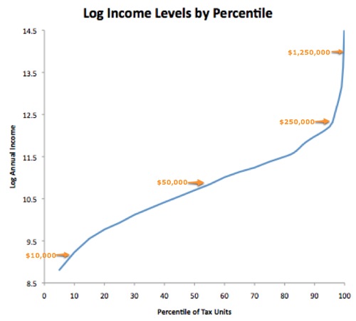
Case in point: A graph of the log income distribution and why the rich don't feel so rich, via Catherine Rampbell (always awesome), Brad Delong and Paul Krugman.
I've read zillions of statistics and have seen a lot of excellent graphs on the income distribution. But this really brings it home in a salient way. Indeed, I hadn't even realized the graph of log income looked like this. And I've seen the data a lot of times in a lot of ways.
People usually hang out with people more-or-less like themselves, in terms of income and other demographics. Now, if you make 250K/year, it's likely that a lot of your friends make twice as much or more than you do. That's a lot less likely if you make just 50K a year. So, if you're judging your income and wealth relative to your friends, you may feel much worse at 250K than you do at 50K. Or maybe even 25K/year.
Update: If you're not familiar a natural log scale, one point difference on the vertical axis, say 9.5 to 10.5, indicates a doubling of income. Also, a single "tax unit" is basically household filing a tax return.
Some say the rise in income inequality is all about education. The convexity of that graph at the upper tail tells me there's a lot more to the story.
So, I'm about to give my first lecture this semester to principles of economics students, and to tell them about the tradeoff between efficiency and equality. But these days I wonder if we can't have at least a little more of both efficiency and equity, at least as measured in utility.
Update: This also seems to help make sense of the finding in the psychological literature that suggests households with about 75K of income are happiest. Clearly, more income is better all else the same. If you have much below 75K you're, well, poorer, but the relative distribution of wealth nearby isn't much different than if you made 75K. If you go much above 75K, you're likely drooling with envy at some proportionately much, much richer friends and acquaintances, which takes away a lot of thrill of being richer.
Subscribe to:
Post Comments (Atom)
Renewable energy not as costly as some think
The other day Marshall and Sol took on Bjorn Lomborg for ignoring the benefits of curbing greenhouse gas emissions. Indeed. But Bjorn, am...

-
The other day Marshall and Sol took on Bjorn Lomborg for ignoring the benefits of curbing greenhouse gas emissions. Indeed. But Bjorn, am...
-
The tragic earthquake in Haiti has had me wondering about U.S. Sugar policy. I should warn readers in advance that both Haiti and sugar pol...
-
A couple months ago the New York Times convened a conference " Food for Tomorrow: Farm Better. Eat Better. Feed the World ." ...


No comments:
Post a Comment