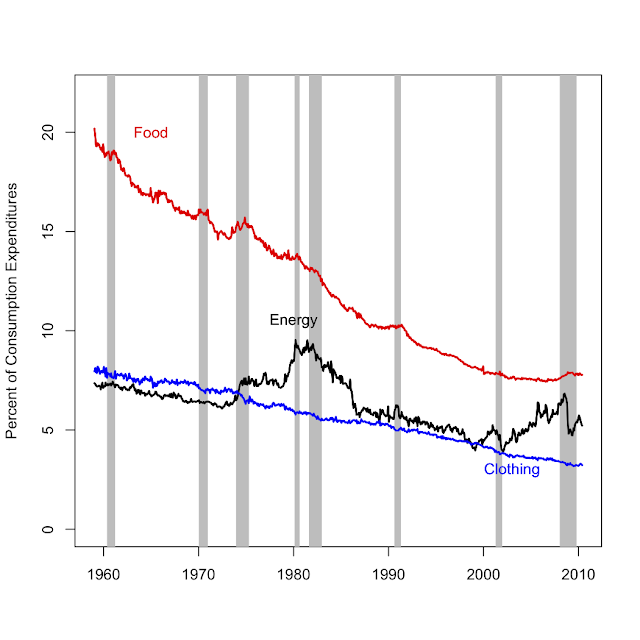
I haven't posted a graph in awhile, so here is one I just made for a presentation I will give today.
The plot shows the percent of household consumption expenditures on food, clothing and footwear, and energy (NIPA accounts, downloaded from EconStats: http://www.econstats.com/nipa/ ).
The grey bands are recessions.
There's not too much to say about this that isn't obvious. Volatile energy prices explain the fluctuations in energy consumption shares, and these are often associated with recessions. Food and clothing shares have shown a steady trend down, as production efficiency has increased and prices have fallen [relative to income]. Demand is relatively inelastic which means the consumption share has declined with [relative] price, even though per-capita quantities have increased (the obseity problem, larger closets, etc.) The smoothness of food and clothing expenditures also attest to inelastic demand and perhaps the monopolistically competitive nature of retail businesses that sell these products. That is, retailers probably absorb much of the fluctuations in costs. Finally, notice how the food share increases a bit during recessions. That's mainly because total consumption expenditures (the denominator) goes down and food expenditures hardly change.
So, where do consumers cut back when energy prices and expenditure shares spike? That would be durable goods, like cars and appliances (not shown).
Update: Jim MacDonald (comment below) is right. It's prices relative to income that have fallen, but this is much more about income growth than falling prices.
Also, I'm speculating on the fluctuations part. I'd guess there is near full pass through of costs to price in the long run but not in the short run, just based on my intuition of monopolistically competitive markets. Empirically, I cannot really draw that conclusion from the graph because costs are mostly labor anyway, and labor costs tend to be smooth anyway.
Subscribe to:
Post Comments (Atom)
Renewable energy not as costly as some think
The other day Marshall and Sol took on Bjorn Lomborg for ignoring the benefits of curbing greenhouse gas emissions. Indeed. But Bjorn, am...

-
The other day Marshall and Sol took on Bjorn Lomborg for ignoring the benefits of curbing greenhouse gas emissions. Indeed. But Bjorn, am...
-
The tragic earthquake in Haiti has had me wondering about U.S. Sugar policy. I should warn readers in advance that both Haiti and sugar pol...
-
A couple months ago the New York Times convened a conference " Food for Tomorrow: Farm Better. Eat Better. Feed the World ." ...


Mike,
ReplyDeleteNice chart, but I don't know about the price claim for food. Growth in the food cpi pretty closely matches that for the overall cpi, so it seems hard to get a relative price effect for food in consumption (poor productivity growth in retail and processing offsets high productivity growth in agriculture). Why shouldn't the food chart just reflect Engel's Law--income growth and a low income elasticity of demand for food?
Jim MacDonald
Coming at this from a slightly different perspective, my question about food (and clothing?) would be about value. Are people getting as much nutrition from their food, even as what they pay goes down? And the constant churning of clothes demanded by fashion and perhaps by poor manufacture, is there some sense in which people are spending less and getting less? In both cases, people are probably getting more of the basics -- calories, square metres of fabric -- but less, I fear, of something less easy to measure.
ReplyDelete